The Pixel Art of Salaryman Shi
Author: Vertette Filed under: Pixel art Posted: October 1, 2023 14:00:00
It was late 2019. I was bored out of my skull, waiting for DJ Coco to fix up a build for Paperball so I could get back on testing, but I didn't feel like working on any particularly big project at the time. I looked around my hard drive looking for anything to do and found some old mock-up graphics I made for an old, abandoned project. A feeling of nostalgia immediately washed over me.
Back in 2013, me and DJ Coco had plans for a 2D platformer named Rad Dude. Shovel Knight was busy blowing up Kickstarter at the time, and in turn, we were inspired to try and make a sidescroller of our own. It would be an 8-bit love letter to all those old, bizarrely localized games on the NES that felt the need to shove in MACHO DUDES, BADNESS and everything else GNARLY about the 80s. It starred the titular Rad Dude and his best friend, Cool Chick, as they rocked denim clothes and used all kinds of crazy gadgets to rescue the city from an evil toymaker.
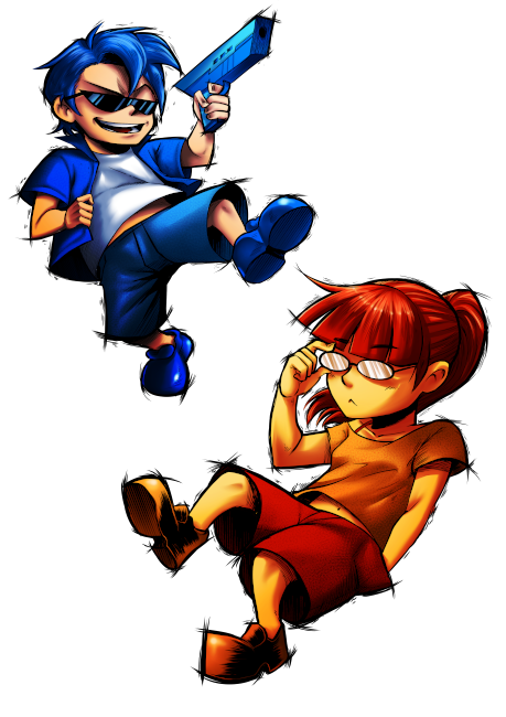 I'm rad.
I'll spare you the details because, well, there wasn't much more to it than that. DJ Coco quickly abandoned the project after it became clear that the idea was lacking, which angered and saddened me quite a bit. In hindsight, Rad Dude was clearly not going to be anything special. We didn't actually have much experience, money or vision for the game, so it never really had a chance to be anything good with the level of our skills back then. At the time, though, I didn't see it that way. I felt betrayed by my best friend as I thought we were truly onto something. In the end, with not much progress having been made on the game itself, all I was left with was a bunch of ideas and some mock-up graphics as the both of us moved on to other projects.
I took those same old Rad Dude graphics six years later and saved over them, not even caring to keep a back-up of it anywhere. With Mario on my mind at the time - Mario being the first thing I'll draw if I want to draw but don't know what to draw - I mutilated the old pixel art to turn it into an ersatz version of Super Mario Bros., and suddenly an idea sprang in my mind: I could use these graphics to make a small joke game that would look and feel like a Chinese bootleg developer made their own take on the classic Mario games.
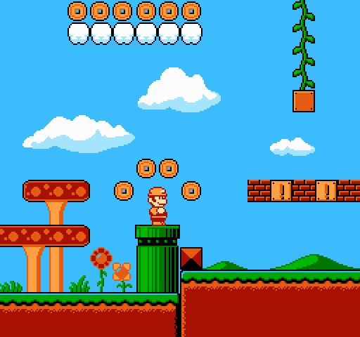 Before...
I sent the mock-up to DJ Coco, expecting him to find it as funny as I did. Instead, he was unimpressed. "It's pretty on the nose", he said. "Yeah, that's the point," I explained. "It's going to be like a bootleg Mario, glitching out at times and whatnot. It'd be funny." "Honestly, that sounds kinda boring," he shot back. "I would just rethink the entire idea." And so I went back to the drawing board, trying to figure out what to do with this mock-up. I did another search through my hard-drive and, by luck, stumbled onto yet another old abandoned project of mine. Suddenly, it hit me. I started giggling, then chuckling, then I burst out in laughter. It was stupid, it was hilarious and it had lots of potential.
After Rad Dude's death, I started making a game in RPG Maker VX Ace. I had an obsession with Takeshi no Chosenjo at the time and wanted to make something with a similar style and tone, and so I named my game Takeshi's Second Challenge. It would be an RPG starring a salaryman named Takeshi Shi, and it was going to be somewhat unique in that you could only raise stats or earn money by doing minigames. You would increase your stats by working out at the gym and make money by doing various odd jobs. Combine that with the obligatory Dragon Quest-esque battles and a dark, surreal sense of humor and I ended up with a prototype that was surprisingly fun for what it was. (And yes, I do like No More Heroes.)
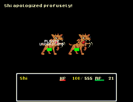 I had to hook up my old PC to take a screenshot of this.
The problem with Takeshi's Second Challenge, however, is that while I loved the idea, I didn't have the programming or art skills to do the idea justice. While it was fun to work in RPG Maker to try to push the limits of the engine as far as I could, I quickly ran into issues as the scope of the game became too big for me to handle. I didn't know how to program the engine into doing what I wanted it to do, didn't have the art skills to make it look as good as I envisioned it to be and didn't have the budget to compensate for either of these shortcomings. That's why I reluctantly decided to shelf the game indefinitely, planning to return to the game one day in the future.
And so, years later, I sketched up a bored looking Takeshi Shi, some boxes, a ladder and some bills, put them into the mock-up and sent the result to DJ Coco, who couldn't stop laughing either. We quickly started throwing ideas around: how the game would play, what kind of power-ups it would have, what the goal would be and so on. It didn't take long until we agreed to turn this into a real game after he was done developing Paperball, which we were sure wouldn't take that long. An actual year and a half later, after various patches, three DLC packs and a Nintendo Switch port, we would finally begin work on Salaryman Shi.
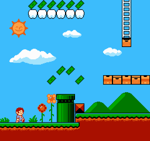 ...and after.
As you can see, the game was originally going to be 8-bit just like Rad Dude, but I quickly changed my mind on this for two simple reasons: 1) it's boring and 2) %&$#ing stop it already. Shi could never hope to stand out in the ocean of identical looking 2D 8-bit platformers on Steam. I started experimenting with making a 16-bit art style for the game, which is the first time I tried to draw actual 16-bit art that wasn't just replicating another game's art style, but my earliest attempts were so bad DJ Coco rejected them on the spot. That was surprising, as he can be harsh, but he's usually not that harsh. He suggested simply going back to an 8-bit style, but I was too stubborn to do that. I knew I had it in me to challenge myself and put out a game that would, at the very least, not embarass me with its visuals.
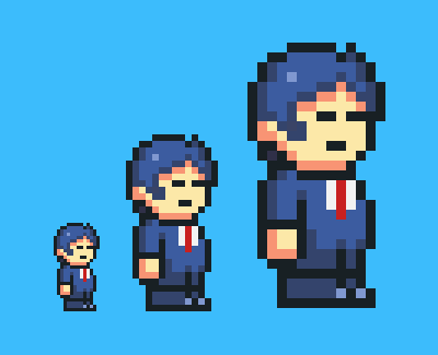 How are you going to accomplish that? Definitely not like this. Yuck.
Yet the longer I tried to develop Shi's art style, the more I felt frustrated at myself. I knew I was capable of at least putting out competent art, but it still wasn't clicking for me. All the art I was putting out was garbage. I tried various different drawing tools just to see if something would change, and that's when the light bulb finally blinked on: the only times I've ever tried to make pixel art more complex than in an NES game is when I was working on ROM hacks. Somehow, that was the big difference. I installed YY-CHR and Lunar Magic, started putting a palette together and quickly drew up a few mock-ups after. I showed the results to DJ Coco, who said: "looks OK but could be a bit more original". Now we were finally getting somewhere.
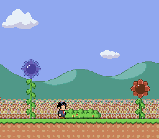 That's right, there was a time where Shi looked even more like Super Mario World.
In that sense, Salaryman Shi's look isn't just accurate to 16-bit era visuals, it works on actual 16-bit hardware. Outside of the use of a few transformative effects (which could still be replicated with the Super FX chip), everything about it works with the real SNES's limits: the RGB values, the amount of colors per palette row and total palette rows, even the amount of VRAM dictacting how many unique tiles can be used at a given time. I could rave about this stuff for hours, but I'll spare you from the exact technical details. TL;DGAF: Shi's art works on the SNES.
Now the obvious question is, why would I go through all that trouble for something that's so trivial that nobody will ever notice and/or appreciate it? The answer might surprise you - it's because it made it easier to draw. The paradox of limitations is that, when you set some hard limitations for yourself, it becomes easier to be creative. After all, having no limitations at all means anything is on the table. Limitations, on the other hand, make it very easy to determine what you can and can't do. As an indie developer who's seen dozens of people burn themselves out with crazy ambitious ideas and scope creep, I've found that not many artists in this industry embrace their limitations. They get it in their head that their first game needs to have a scope bigger and more ambitious than they could reasonably take on. It's a mistake that, as you can reasonably assume from Salaryman Shi's complicated history, I've made many times myself.
And yet it really doesn't have to be that way. That's the great thing about independent games: there's much less pressure to deliver something big and perfectly polished because consumers don't expect that most indie developers have the budget for that (unless your game is priced appropiately). If it's decent, people will forgive it for not being very unique. And if it's a bit rough, people won't mind as long as you're trying something new. It really is that simple.
Salaryman Shi went on to sell about 1.400 copies. That's nothing to brag about, but it was never going to be a game that'd rock the industry or something that'd change the way people look at games, and it was never meant to be. It was a small game that me and DJ Coco made in our spare time for fun. Because our plans were never that ambitious, it was easy to just keep working on it, knowing that the final game would be done Real Soon Now™. The base game ended up only taking a year to develop, with the free DLC only taking a few extra months on top, and with its budget being so low we ended up making a pretty decent profit off it.
If you stop thinking of limitations as what you can't do, but instead as what you can, everything becomes much easier.